T-Taxi | Autonomous fleet operations
How I separated the stream of raw alerts from real incidents so a single engineer could run a shift of dozens of vehicles without missing critical events.

1. Context
T-Taxi is a concept for an internal tool for an autonomous-taxi monitoring center. It’s the workstation of an on-duty engineer: desktop, dark theme, 24/7 shifts, and a constant stream of events from vehicles.
The core challenge isn’t too few signals. Quite the opposite — there are too many. A vehicle sends telemetry, errors, warnings, and statuses. Show all of it as separate alerts and the queue quickly turns into noise.
Users
-
Monitoring engineer. During a shift they’re responsible not for a single screen or a single vehicle, but for the state of a whole zone of dozens of vehicles: triaging incidents and staying in contact with field crews, teleoperators, passenger support, and the shift lead.
-
Shift lead. They coordinate several engineers and step in on escalations. A dedicated screen for them wasn’t designed in this iteration, but their needs are accounted for as data (action history and shift handover) rather than as an interface.
What counts as success
- For the business — higher fleet uptime, lower cost per incident handled, more vehicles per operator (scalability), safer operation.
- Operational metrics: MTTA, MTTR, share of incidents resolved remotely, alert false-positive rate.
- For the user — a calm shift with no missed critical events: quickly grasp what’s happening, what matters right now, and what the next action is.
Both framings are about the why. Metrics for specific decisions are separate, in the “How I’d measure success” section.
2. Constraints and scope
This is a test assignment, and I had a few days. So I focused on the two most frequent and most risky parts of a shift — where an engineer actually loses time or misses an important event:
- incident triage — queue, map, priorities, and filters;
- incident resolution — a card with vehicle context, symptoms, and actions.
What the research showed
Desk research revealed a few recurring patterns: one operator supervises dozens of vehicles, untreated signals quickly turn into noise, and the monitoring-center workstation relies on three anchors: the map, the queue, and key metrics.
Signal overload
The main NOC problem is not a lack of signals, but too many of them. Raw alerts create noise, duplicate each other, and make it harder to understand what matters. The engineer should work with an incident as the triage unit, not with individual signals.
One engineer, dozens of vehicles
Public materials on autonomous transport mention different vehicle-to-operator ratios:
- Waymo: around 1:43
- Cruise: around 1:15-20
- WeRide: around 1:3
For this case the takeaway is simple: the queue has to support dozens of incidents per on-duty engineer without extra noise.
A basic Fleet Ops pattern
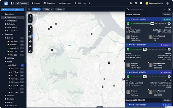
For systems like this, the typical layout is a map, a queue, and a KPI summary. The map supports localization, the queue supports prioritization, and KPIs provide the shift-level picture.
Severity and lifecycle
Incident management needs priority and status to be visible immediately. I use P1-P4 and this lifecycle:
- new
- accepted
- in progress
- snoozed
- resolved
Fleet charge and availability
An electric fleet needs a two-level SoC view: an aggregate donut or heatmap at fleet level, and exact charge percentage and remaining range at vehicle level. That helps the engineer understand both a single-vehicle issue and the state of the shift.
4. Assumptions
I had no access to real operators, so some decisions rest on desk research and explicit assumptions. I’d validate each one with its own method during a pilot.
| Assumption | Why I think so | How I’d validate it further |
|---|---|---|
| One engineer can handle dozens of vehicles | Public data from Waymo (~1:43) and Cruise (~1:15–20) give different ratios, but the order of magnitude is similar | Operator interviews during the pilot and shift logs |
| A shift brings dozens of events, not a handful | Patterns from NOC tools and fleet ops | Product analytics during the pilot |
| Most incidents are routine operational ones, not critical | Low charge, connection loss, fault codes, and availability statuses are typical for a fleet | Analysis of past incident logs |
| A critical incident must break through filters | In a NOC context, a new P1 outranks the operator’s current working mode | Scenario testing with operators |
5. Shift scenarios
The user’s main job
Close out a shift so that critical incidents are noticed in time, prioritized correctly, and carried through to resolution without losing context.
This large job breaks down into several typical situations within a shift.
| Scenario | What happens | What the interface needs |
|---|---|---|
| A stream of similar alerts | A vehicle sends several similar signals in a row | Group them into one incident with symptoms |
| A new P1 mid-work | The engineer is already working a card when a more urgent incident appears | Surface the P1 above filters and current focus |
| Connection loss | A vehicle disappears from the map or stops sending telemetry for a while | Show status, timing, and severity without switching layers |
| Low charge | The vehicle may still be in service, but the risk is growing | Tie together charge, availability, and a recommended action |
| Shift handover | The engineer resolves or snoozes an incident | Preserve the action history and a note for the next shift |
6. Prioritization
After the scenarios, I picked out where the interface can actually reduce the engineer’s load. The estimates are expert judgment based on desk research, not quantitative data.
| Opportunity | Why it matters | Solution |
|---|---|---|
| Group alerts | Cuts noise and the number of objects in the queue | Incident instead of raw alerts |
| Give an explicit P-level | The engineer sees what to take first | P1–P4 in the queue and the card |
| Don’t hide the map | You need to see the zone while triaging | The card opens as a side panel, not a modal |
| Separate status and severity | A vehicle can be “in service” yet carry a P1 | A dot shows status, a ring shows severity |
| Suggest the action | Rare fault codes are hard to remember | The toolbar highlights the recommended action |
| Preserve history | The shift needs to know what’s already been done | An action log and a shift-handover note |
Triage and resolution are the most frequent high-weight sub-jobs. Those are my focus: they account for most of an on-duty engineer’s time.
7. Problem statements
Three problems the design solves in this iteration — one per priority sub-job.
- Triage. The on-duty engineer can’t triage the queue in 60–90 seconds because alerts arrive as a raw stream with no deduplication and no explicit severity levels. This leads to missed P1s and SLA breaches.
- Resolution. The engineer can’t reach a decision on an incident within 2–3 minutes because the context they need is scattered across telemetry, the alerting system, incident history, and team chat. This leads to false crew dispatches, or to delays where real help is needed.
- Parallel events. The engineer loses either a new P1 (which needs a response within 30 seconds) or the context of their current work, because handling one incident hides the view of the queue. This doubles the time on the incident in progress and creates the risk of missing something critical.
8. Solution
The core idea is to separate incoming signals from the engineer’s work objects. An alert is a raw signal from a vehicle; an incident is a unit of work with its own symptoms, priority, status, and next action. So the interface doesn’t show a stream of duplicates as a task list — it gathers signals into manageable incidents.
Object model
Several signals from one vehicle — connection loss, low charge, a fault code, a repeat signal — converge into a single incident. All the working context gathers around it: the vehicle, fault codes, actions, the operator, and the shift note. This is the object the engineer actually works with.
Monitoring screen
The queue answers “what to work first,” the map answers “where,” and the right column answers “how’s the shift overall”: KPIs, fleet SoC, a per-zone breakdown, and the previous shift’s note stay as background data and don’t compete with the queue.
An incident instead of a stream of signals. Group raw signals into incidents and the engineer clears the queue faster and loses fewer critical events. An alert stays an event from a vehicle; what reaches the queue is an incident: connection loss, low charge, a fault code, and repeat signals from one vehicle converge into a single object with symptoms, priority, and status. At peak this compresses the queue 5–10× — the engineer works with one problem instead of twenty rows of duplicates.
Severity reads the same everywhere. If severity doesn’t depend on row selection, filters, or scrolling, the engineer is less likely to miss a P1 during parallel work. The P1–P4 level is encoded as a separate visual layer: the bar in the queue doesn’t disappear on selection, sorting runs P1→P4, a new P1 breaks through active filters, on the map the incident gets a severity ring, and in the card the priority is pinned to the header. It’s one severity signal running through the queue, the map, and the card — the operator’s current focus must never mask a safety event.
The map separates “what the vehicle is doing” from “is there an incident.” Split vehicle status and the presence of an incident into different channels and the engineer reads the situation without switching layers. The dot shows what the vehicle is doing — driving, charging, out of service, or connection lost; on connection loss an uncertainty zone appears around it, because the exact position is no longer known. Movement status and the fact of an incident are different questions: the first lives in the dot, the second in the severity ring from the previous point. This split isn’t conveyed by color alone, which means it also works for a colorblind engineer.
Fleet monitoring on the map
The incident queue, a map with vehicle statuses, and shift metrics. Hover over the elements to break the interface down piece by piece. The incident queue, a map with vehicle statuses, and shift metrics. Start the walkthrough to break the interface down piece by piece.
Hover over screen areas or start the step-by-step walkthrough. Start the step-by-step walkthrough.

Hover — outline first, preview follows. Click — step-by-step walkthrough. ← → move the frame between steps · click the screen / Esc — exit
Incident card
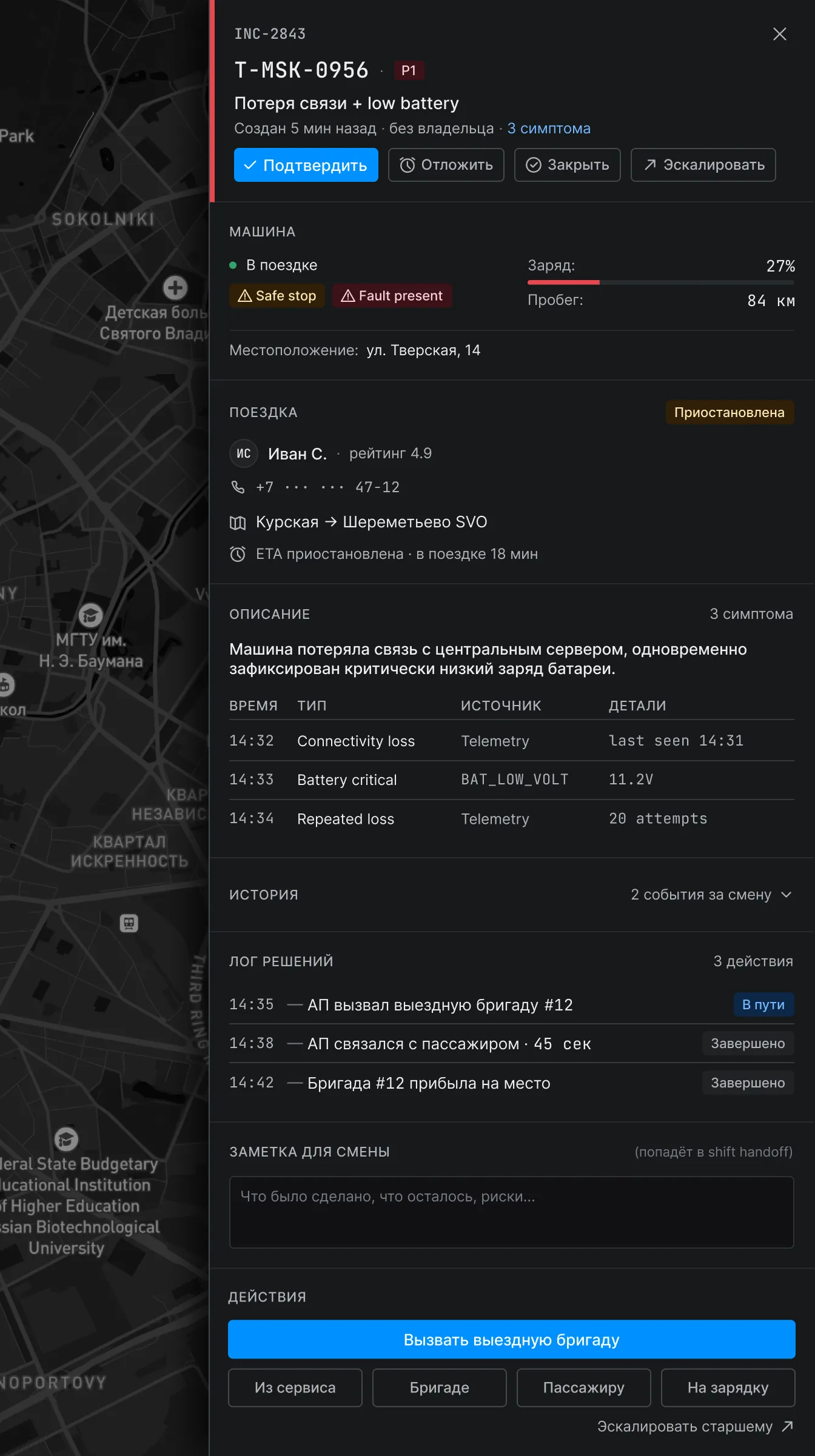
Clicking an incident opens a card on the right. It’s not a modal: the queue and the map stay visible. While the engineer works one incident, another may appear in the zone — there’s no linear flow here.
The incident as the center of context. Gather the vehicle, the trip, symptoms, actions, and history around a single incident and the engineer stops jumping between the map, a table, chat, and external systems. The card is built around the incident as a work object: attached to it are the vehicle and its trip (passenger, route, ETA), a symptoms table, an actions panel, a resolution log, and a shift-handover note. The incident stops being a row in the queue and becomes the unit that holds the whole investigation together — which also simplifies shift handover and scaling to new problem types.
The fault code leads to an action. If the system suggests an action based on the leading fault code, the engineer decides faster on a rare scenario they hit once every few shifts. The leading code carries a recommended action at the data level — the panel highlights the right option but doesn’t trigger it on its own. The hint offloads memory but doesn’t replace the human: in a safety-critical interface the system guides, and the final decision stays with the engineer.
Hover over a card area or start the step-by-step walkthrough. Start the step-by-step card walkthrough.
Hover — zone preview. Click a zone or the button for a step-by-step walkthrough. ← → steps · Esc — exit
9. Trade-offs
Three decisions where I considered an alternative and deliberately chose one.
Side panel vs. modal. I considered a modal with an overlay and a side panel. I chose the panel because a NOC is a multitasking context, not a linear wizard: while the engineer works one incident, a new P1 can appear. I give up a bit of room for the card. That’s fine — visibility of the queue and the map matters more than card width: a missed parallel P1 costs more than a cramped panel.
P1–P4 vs. P1–P5. I considered 5 severity levels (like PagerDuty) and 4. I chose 4 because each level has to map unambiguously to a class of response: P1 — immediate / safety, P2 — urgent, P3 — can wait, P4 — informational. I give up granularity. That’s fine — a fifth level blurs the line between neighbors and slows the “what to take first” decision, and the speed of that decision is the essence of triage.
Snooze as a status vs. a hidden flag. I considered snooze as a flag (just hide the row) and as a full lifecycle status with a snoozedUntil field. I chose the status. I give up a slightly more complex data model. That’s fine — a flag pushes the “don’t forget” job back onto the operator, whereas a status with a timer returns the incident to the queue on its own. Plus it’s the standard Datadog / PagerDuty pattern.
10. How I’d measure success
This is a test concept — there’s no real baseline. For each decision I set a metric and the direction of the effect; I’d measure the baseline itself during a pilot and set the target from there. The only target that’s derived by calculation rather than guessed is the compression of raw alerts into incidents.
| Decision | Metric (measured via) | Direction / target |
|---|---|---|
| Alert → Incident | ratio of raw alerts to incidents at peak (system events) | 5–10× compression |
| Snooze as a status | share of incidents with no action for more than N minutes during an active shift (N calibrated in the pilot) | ↓ forgotten P3/P4 |
| Side panel instead of a modal | TTA for a P1 that appears mid-work (product events) | ↓ response time |
| Recommended action | time-to-action for rare fault codes (below a frequency threshold from logs) | ↓ time to the correct action |
| Dot + ring on the map | time-to-locate a vehicle by incident ID | ↓ search time |
The Alert → Incident metric measures the mechanism itself: the raw alerts haven’t gone anywhere, they still arrive from vehicles at the input — I only removed them from the queue as separate rows. The “raw alerts → incidents” ratio shows how effective the compression is.
These metrics are leading indicators. The shift’s operational metrics (MTTA, MTTR, share of incidents resolved remotely, false-positive rate, fleet uptime) are what they should convert into if the hypotheses hold. I’d measure those in the pilot as the outcome layer, without tying them to any single decision.
11. What’s next
The next iteration is about testing on real shifts: operator interviews and a review of past incident logs (where time is lost, which alerts duplicate, which actions get chosen wrong, how context passes between shifts). This closes the assumptions from Section 4 and gives a baseline for the metrics in Section 10.
From there, the product can go deeper:
- a heatmap of fleet charge and availability;
- a full shift-handover screen;
- time-based escalation on connection loss;
- empty / hover / active / error states for all controls;
- a separate surface for the shift lead.